Tutorial#
If you have a microcontroller with a screen capable of color graphics,
you want your applications to be able to draw to it in an efficient and
consistent way. Micropython includes the framebuf module, which
allows you to draw into a region of memory, but even for a small screen
drawing in 16-bit color is very expensive. Additionally most of the time
you only need to update small parts of the total screen area when displayed
data changes, but a framebuffer can’t track what is drawn in the region
that needs updating and so you will likely end up redrawing everything.
Basic Drawing#
Tempe abstracts these concerns away by providing a Surface object that
represents a layered 2D coordinate space, and tracks the Shape objects
that are drawn to it:
surface = Surface()

# fill the background with white pixels
background = Rectangles([(0, 0, 320, 240)], [0xffff])
surface.add_shape(BACKGROUND, background)

# draw some black text in the main drawing layer
hello_tempe = Text([(160, 120)], [0x0000], ["Hello Tempe!"], [(CENTER, CENTER)])
surface.add_shape(DRAWING, hello_tempe)
To actually render the image, you need to provide a Display subclass
that can handle copying a buffer to a rectangle on the physical device.
Particularly for non-standard devices or interfaces, you may need to
write this code, but there are examples of how to do this for common
displays.
You also need to provide a writable chunk of memory (such as a
bytearray) that Tempe can use to render raster images into before
copying them to the display. The larger this chunk of memory is the better,
but it can (and probably should) be allocated once at the start of the
application and reused repeatedly for drawing operations.
Actual drawing is performed by calling refresh() with the display and
the buffer:
# a buffer one quarter the size of the screen
working_buffer = bytearray(2*320*61)

# set up the display object
display = ST7789()
display.init()

# refresh the display
surface.refresh(display, working_buffer)
The refresh() method only updates the region of the screen that needs
updating (in this case, since this is the first refresh, it will be the
entire screen), and automatically handles situations where the working
buffer is too small for the size of the region which needs to be rendered.
Under the covers, it is making calls to the built-in framebuf
module to set the pixels in the working buffer for the region that is
being updated, before copying the data across to the screen device.
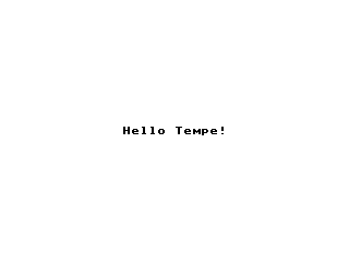
This should display something like the following:
Shapes and Geometry#
Tempe provides a number of fundamental Shape subclasses, mostly based
around what the underlying framebuf library provides: lines,
rectangles, ellipses and general polygons.
However the Tempe shape objects represent multiple instances of each of these objects, as this permits more efficient iteration and representation of the shapes. For example, to draw the bars of a bar graph you might want to draw three rectangles with three different colors, so you can call:
bars = Rectangles(
    [(4, 4, 8, 100), (4, 16, 8, 80), (4, 28, 8, 50)],
    [red, lime, blue],
)
surface.add_shape(DRAWING, bars)
Where these rectangles are a related part of a larger graphical entity, it will generally be more efficient than drawing the three rectangles separately.
These shape objects expect to be given an appropriate Geometry that
describes the geometric properties of each iteration of the shapes
to be rendered. For Rectangles it expects to get a Geometry that
can be iterated over to produce sequences of length 4, holding x, y,
width, and height, but other shapes expect different geometric information.
For example, Circles expect an iterator that produces x, y and radius,
while Polygons expect the iterator to produce array
instances with alternating x and y values: [x0, y0, x1, y1, x2, y2, …].
RowGeometry#
Tempe refers to this basic object-by-object representation of geometric
information as “row-oriented” geometry, and provides the RowGeometry
class as a helper. For example, if we wanted to create a collection of
Polygons then rather than having to write something like:
triangles = Polygons(
    [
        array('h', [10, 10, 10, 20, 20, 20]),
        array('h', [20, 10, 20, 20, 30, 20]),
        array('h', [30, 10, 30, 20, 40, 20]),
    ],
    [red, lime, blue],
)
you can instead call:
triangles = Polygons(
    RowGeometry.from_lists([
        (10, 10, 10, 20, 20, 20),
        (20, 10, 20, 20, 30, 20),
        (30, 10, 30, 20, 40, 20),
    ]),
    [red, lime, blue],
)
which will handle creating the arrays for you. Similarly if we were to create the rectangles using:
bars = Rectangles(
    RowGeometry.from_lists([
        (4, 4, 8, 100), (4, 16, 8, 80), (4, 28, 8, 50)
    ]),
    [red, lime, blue],
)
then the data will be converted to arrays of 16-bit integers, which use less than half as much memory.
ColumnGeometry#
When building geometry it can sometimes be more convenient to specify the geometric properties in different ways than “row-oriented”. For example, when building a horizontal bar chart, the principal information that you are working with is a sequence of bar widths. It’s natural then to want to build the geometry instead in a “column-oriented” fashion: a sequence of x-values, then a sequence of y-values, then a sequence of widths, and finally a sequence of heights.
Tempe provides a ColumnGeometry class for this purpose:
xs = [4, 4, 4]
ys = [4, 16, 28]
widths = [100, 80, 50]
heights = [8, 8, 8]

bars = Rectangles(
    ColumnGeometry([xs, ys, widths, heights]),
    [red, lime, blue],
)
When the geometry is expressed this way, we can see that there is a lot
of repetition in the columns and as we’ll see when we talk about DataView
classes, we can take advantage of this to produce more compact and efficient
representations of the geometry.
StripGeometry#
Another common type of data visualization is a line plot. The Lines
shape expects its geometry to provide it with sets of end-point coordinates
(x1, y1, x2, y2). So if we have data points at (10, 20), (15, 50), (20, 40),
(25, 60) and (30, 25), then to plot those with RowGeometry you would
need to have something like:
line_plot = Lines(
    RowGeometry.from_lists([
        [10, 20, 15, 50],
        [15, 50, 20, 40],
        [20, 40, 25, 60],
        [25, 60, 30, 25],
    ]),
    colors=[black] * 4,
)
It’s clear that this is inefficient, as the second coordinate pair is
repeated as the first coordinate pair of the next line. ColumnGeometry
is not much better unless you do clever things with memoryview
objects.
In cases like this, where part of the geometry from one iteration is used
in the next, Tempe provides the StripGeometry class, where vertices can
simply be provided as an array of x, y values and it will generate the
appropriate sets of values for each iteration.
For example, a line plot can be written as:
line_plot = Lines(
    StripGeometry(
        [10, 20, 15, 50, 20, 40, 25, 60, 30, 25],
        n_vertices=2,
        step=1,
    ]),
    colors=[black] * 4,
)
Other common geometries created this way are triangle and quad strips.
DataView Classes#
Looking at the column geometry section above:
xs = [4, 4, 4]
ys = [4, 16, 28]
widths = [100, 80, 50]
heights = [8, 8, 8]

bars = Rectangles(
    ColumnGeometry([xs, ys, widths, heights]),
    [red, lime, blue],
)
you might notice that the xs and height values are repeated.
For three rectangles, this is not likely a problem, but if you are
plotting 100 or 1000 values, the memory use starts to add up. In these
situations it makes sense to trade-off a lot of space for a little
computation time.
Tempe provides a number of DataView classes that allow data values
to be “viewed” in different ways. For example, there is a Repeat
data view which creates an iterable that repeats a value over and over.
So we could instead have used:
xs = Repeat(4)
ys = [4, 16, 28]
widths = [100, 80, 50]
heights = Repeat(8)

bars = Rectangles(
    ColumnGeometry([xs, ys, widths, heights]),
    [red, lime, blue],
)
Similarly there are Count and Range data views that generate evenly
spaced values, and a Cycle data view that extends an iterable by
repeating it cyclically. All of these data views can be used both for
Geometry parameters and for colors and other aesthetics:
xs = Repeat(4)
ys = Count(start=4, step=12)
widths = [100, 80, 50]
heights = Repeat(8)
colors = Cycle([red, lime, blue])

bars = Rectangles(
    ColumnGeometry([xs, ys, widths, heights]),
    colors,
)
Using data views, geometries and shapes, you can quickly and efficiently build standard data visualizations:
def horizontal_bar_chart(
    surface,
    x, y,
    widths,
    labels,
    colors,
    bar_height=8,
):
    label_width = 8 * max(len(label) for label in labels)
    label_xs = Repeat(x)
    bar_xs = Repeat(x + label_width)
    ys = Count(y, bar_height)

    label_text = Text(
        ColumnGeometry([label_xs, ys], labels),
        labels,
        Repeat(black),
    )
    bars = Rectangles(
        [bar_xs, ys, widths, Repeat(bar_height)],
        colors,
    )
    surface.add_shape(OVERLAY, label_text)
    surface.add_shape(DRAWING, bars)
The High-Level API#
It makes sense to have a higher-level API that is more understanding of common use-cases.
For example, so far we have been using a pattern of two-step creation of shapes, where we first create a shape and then add it to a layer of a surface. Since you almost always want to add shapes to a layer immediately after creating them, it would be useful to have a method to do this in one step.
Similarly it is common that you only want to draw one instance of a
geometry in a particular operation, and in those cases it would be nice
to avoid having to create a Geometry instance. And it is often the case
that a particular set of shapes will all have the same color or other parameters,
and in those cases it is annoying to have to specify a Repeat data view
for every parameter.
Finally, the low-level API doesn’t do any sort of sanity checking that geometries match what is expected by the shapes, so errors occur only when the surface attempts to draw the shape into a raster.
The Surface object provides this higher-level convenience API via
methods like polygons(), rectangles(), circles(), and so on. These
methods do basic sanity-checking for geometries, and for other parameters
will automatically turn single values into Repeat data views and do basic
conversion where it makes sense (eg. turn hex color strings into color ints).
They expect to be told which layer to use and will add the created Shape to
that layer. All of these methods return the created Shape instance in
case other code needs to use it (eg. to apply updates later).
For example, it’s common to start by applying a uniform background color for a surface in the region that will be viewed by the display. Up to this point we have done this by writing something like:
background = Rectangles(
    RowGeometry.from_lists([[0, 0, 320, 240]]),
    Repeat(colors.grey_f),
)
surface.add_shape(BACKGROUND, background)
Using the convenience methods, you can instead write:
background = surface.rectangles(BACKGROUND, (0, 0, 320, 240), "#fff")
If you never plan to modify the background, you may even be able to just write:
surface.rectangles(BACKGROUND, (0, 0, 320, 240), "#fff")
Note
As a general rule library code built on top of Tempe should still use the lower-level APIs, as they are more flexible and generic. However application and scripting code that wants to do drawing with Tempe should use the higher-level convenience API in most cases.
Colors and Colormaps#
Tempe assumes that all colors are 16-bit/2-byte, but most of the code doesn’t care exactly what encoding is being used: the raw values are passed directly through to the device. However, working directly with integer color values in a format like RGB565 is awkward, particularly if the endianness of the target device is different from the microcontroller.
For a high-level API, we’d like to be able to specify the colors used in a more human-friendly way. Tempe provides a number of facilities in ~:py:mod:tempe.colors to help with this:
a number of basic colors are available as module variables. This include the basic web/VGA colors, as well as a series of greys as
grey_1throughgrey_fwhich correspond to 3-digit hex colors#111through#fff.the
from_str()function accepts 3- and 6-digit hex codes of the form"#abc"and"#abcdef", as well as all extended web color names, and returns a matching RGB565 color.the
rgb565()method takes floating point r, g, b values in the range 0.0-1.0 and converts them to RGB565 colors. There are several other conversion functions for other common formats.
In addition, when creating data visualizations it is common to map numerical
values to colors. The tempe.colormaps package has sub-modules for
a number of common color maps. These include:
tempe.colormaps.viridis.viridis,magma,plasma, andinfernoare perceptually uniform color maps from Matplotlib.tempe.colormaps.twilight.twilightis a circular perceptually uniform color map from Matplotlib.
These are provided as arrays of 256 colors, allowing them to be used either in custom mapping functions, or passed as palettes for 8-bit Bitmaps (see below). Each colormap is 512 bytes, which is why they are stored in separate modules: import only what you need to save memory.
Note
Since development of Tempe has so-far been done on screens that expect data to be transmitted in big-endian byte order, the byte order of colors and colormaps is big-endian. This can be confusing on a system like a Raspberry Pi Pico, which is little-endian.
Complex Shapes#
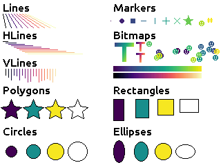
Beyond simple geometric shape classes, Tempe provides a number of more complex shapes:
Text and Fonts#
The Text shape handles drawing text at specified locations and colors.
By default it uses the built-in framebuf font, which is a simple
8x8 monospaced font. It is readable and functional on a typical device,
but is not ideal for general interfaces: in particular it is available in
just one size.
For better text rendering, Tempe currently can use bitmap fonts of the format produced by Peter Hinch’s font_to_py script, or AntiRez’s microfont library, as well as a slightly more efficient internal variant. Tempe provides bitmap versions of Canconical’s Ubuntu font at 16 pt, which looks reasonably good on small screens.
These fonts are typically shipped as modules:
from tempe.font import TempeFont
from tempe.fonts import ubuntu16bold
from tempe.text import CENTER

font = TempeFont(ubuntu16bold)

surface.text(
    DRAWING,
    (160, 120),
    "#000",
    "Hello Tempe!",
    (CENTER, CENTER),
    font=font,
)
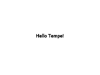
Using this in the original example from the tutorial will generate something like the following:
Since the fonts are stored as bitmaps, large fonts can be expensive to load
and draw. The font file format and tools allow you to generate font files
with only the characters you are going to use. For example, if you are building
a digital clock display then you might create a 48-point font but with just the
digits 0-9, space and separator characters like : and /.
Warning
The way fonts are handled may change in the future, particularly if there is a vector font format that is more efficient to use.
Markers and Points#
The Points shape expects a geometry consisting of an x, y point, the colors
for each point and what to display at each point. This can be:
the special constant
Marker.PIXELto draw a single pixela string, which will get rendered at the location in the default framebuf font
a
framebuf.FrameBuffercontaining a 1-bit imagea
arrayof 16-bit integers giving a polygon to fill
The Markers shape expects a geometry consisting of an x, y point, the colors
for each marker, the size of each marker, and the shape of each marker.
The marker shapes can be specified in the same way as Points (which are
not scaled by size), but additionally as constants Marker.CIRCLE,
Marker.SQUARE, etc. which will be scaled according to the sizes.
Bitmaps#
The Bitmaps shape blits FrameBuffer instances at the given locations.
These must either be in RGB565 format, or supply a palette and optional
key-color for transparency. The ColoredBitmaps shape render 1-bit
framebuffers in the specified colors.
Polar Geometries#
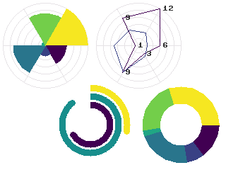
When working with polar plots it is common to have geometry specified by
polar (r, theta) coordinates. For example, a donut plot consists of
multiple annular sectors whose geometry can be easily expressed as sets
of (r, theta, delta_r, delta_theta) coordinates. To draw these, they
need to be converted to Cartesian screen coordinates and an appropriate
geometry for the shape. A number of functions are provided in
tempe.polar_geometry to perform those conversions. For example
tempe.polar_geometry.polar_rects() converts annular sectors to
polygon geometries, which can then be assigned colors and used to create
Polygons.
Since Tempe expects coordinates to be given as unsigned 16-bit integers, angles are expressed as degrees. There is no scaling performed in these transformations, so the radial unit length is a pixel.
Concretely, to create a donut plot for a list of values, you need to work out the start angles and angle deltas for each segment:
values = [...]
total = sum(values)

proportions = [value / total for value in values]
angles = [int(360 * sum(values[:i]) / total) for values in proportions]
deltas = [angles[i+1] - angles[i] for i in range(len(values))]
You can then use this to create a rectangular geometry in (r, theta) coordinates:
segments = ColumnGeometry([
    Repeat(30),
    angles[:-1],
    Repeat(24),
    deltas,
])
This can then be converted to cartesian coordinates using the
polar_rects() function, which returns arrays
of x, y values suitable for use as polygons or polylines:
donut = Polygons(
    polar_rects(segments, decimation=10),
    colormap,
)
The decimation parameter lets you control how coarse or fine to approximate the circular arcs by polygon lines.
Data Visualization#
Data visualization is, at its core, using data to make patterns with geometry, color and other aesthetic properties. But data visualizations also need to provide enough context for a viewer to understand what the patterns are saying, through axes, scales, legends, titles and so forth. With this in mind, we can easily build standard data visualizations out of the building blocks that Tempe provides.
Time Plots#
Microcontrollers frequently read data from sensors of various sorts, so a common need is to plot these values as they vary over time. Line and point plots are a common visualizations that will be understood by most end-users.
Let’s say that we have a collection of temperatures collected over the last couple of days at 10 minute intervals, and their corresponding timestamps:
temperature = array.array('f', [14.87, 14.88, 14.79, 14.94, ... ])
timestamps = array.array('I', [1729500000, 1729500600, 1729501200, ...])
We need to convert these to screen coordinates, so we need a basic idea of the size of the plot and the ranges of values we want to display. In this data set the temperature range is from 12.09°C to 20.36°C, so a range from 11°C to 21°C would be reasonable to encompass the data (if you were dynamically gathering the data you would need some heuristics to choose the range for the actual data, of course). Our screen has a height of 240 pixels, and we want some space for titles, axes, etc. so we will use the region from pixel row 20 to pixel row 220 for the plot. Note that because plots usually have the y-axis oriented upwards but raster graphics has row 0 at the top, row 20 corresponds to 21°C and row 220 corresponds to 11°C.
We can define a simple generic scaling class like:
class LinearScale:
    """Object that maps data to screen values linearly."""

    def __init__(self, low_data, low_screen, high_data, high_screen):
        self.low_data = low_data
        self.low_screen = low_screen
        self.high_data = high_data
        self.high_screen = high_screen
        data_range = high_data - low_data
        screen_range = high_screen - low_screen
        self.scale = screen_range / data_range

    def scale_values(self, data):
        """Scale data values to screen values."""
        screen = array('h', bytearray(2*len(data)))
        low_data = self.low_data
        low_screen = self.low_screen
        scale = self.scale
        for i, value in enumerate(data):
            screen[i] = int(low_screen + scale * (value - low_data))
        return screen
and then use it to scale the temperatures:
y = 20
h = 200
y1 = y + h

temperature_scale = LinearScale(11, y1, 21, y)
ys = scale_values(temperature)
Similarly if we want to display the last day’s worth of temperatures, with x-values ranging from 24 to 312, we get:
x = 24
w = 288
x1 = x + w

time_scale = LinearScale(1729586400, x, 1729672200, x1)
xs = time_scale.scale_values(timestamps)
Note
It’s worth defining a class for this, as we will likely reuse the object when creating axis tick marks, labels and grid lines.
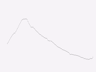
Plotting Points#
Since we have aligned x and y values, we can create a geometry for the
sample points using a ColumnGeometry:
points = ColumnGeometry([xs, ys])
We want constant values for color and the marker type, so we can use
Repeat(colors.grey_3) to get a dark grey color for all points and
Repeat(Marker.PIXEL) to mark each data point with a pixel, and then
we can display it with the convenience function
point(). Because the data covers two
days but we only are showing the last, we want to make sure that the
plot is clipped to the screen region we want to use, otherwise points
will be drawn in the margins:
surface.points(
    DRAWING,
    points,
    Repeat(colors.grey_3),
    Repeat(Marker.PIXEL),
    clip=(x, y, w, h),
)
This produces a visualization like this:
Plotting Lines#
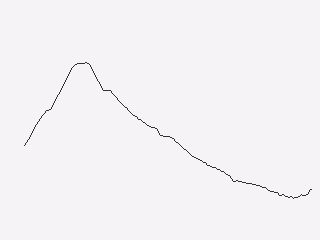
This is showing the data in an acceptable way (and if the data were noisier,
this might be a very good way to display it), but the data is nominally
continuous, so it would make sense to instead use a line plot to show the
data. To draw lines, we need a geometry that produces coordinates of the
form (x0, y0, x1, y1).
We could manually do this by slicing:
y0s = temperature_scale.scale_values(temperature[:-1])
y1s = temperature_scale.scale_values(temperature[1:])
x0s = time_scale.scale_values(timestamps[:-1])
x1s = time_scale.scale_values(timestamps[1:])

lines = ColumnGeometry([x0s, y0s, x1s, y1s])

surface.lines(
    DRAWING,
    lines,
    Repeat(colors.grey_3),
    clip=(x, y, w, h),
)
This works, but it is memory-intensive, we are effectively storing the point
data twice: the cost for this dataset is small (a bit over 1K bytes), but for
larger data sets it can be substantial. We were also sloppy in slicing the
original data, which will have created 4 temporary arrays each also about 1K
in size, but this could be avoided with clever use of memoryview
objects.
But there is a better way of doing this. The PointsToLines class can be
used to iterate through a point, reusing previous values. So if we instead
do:
points = ColumnGeometry([xs, ys])
lines = PointsToLines(points)

surface.lines(
    DRAWING,
    lines,
    Repeat(colors.grey_3),
    clip=(x, y, w, h),
)
This produces a visualization like this:
Plot Decorations#
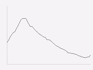
Now we have the data displayed, we need to put it into context so the user can make sense of the values. Due to the small screen sizes, care must be taken to ensure that the display is legible.
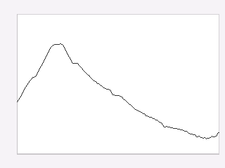
We likely want to indicate to the user which parts of the screen are part of the plot and which are not. You can do this in a couple of ways, such as by drawing distinct axis lines or by distinguishing the rectangle of the plot region (eg. with a border or color change). All are acceptable, but whatever combination you prefer you should be consistent across all the plots in your application.
surface.hlines(
    'UNDERLAY',
    (x, y1, w),
    colors.grey_c,
)
surface.vlines(
    'UNDERLAY',
    (x, y, h),
    colors.grey_c,
)
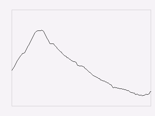
surface.rects(
    BACKGROUND,
    (x, y, w, h),
    colors.grey_d,
    fill=False,
)
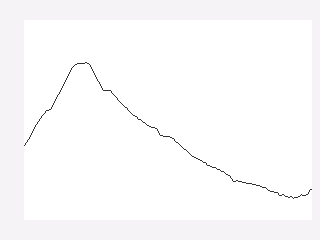
surface.rects(
    BACKGROUND,
    (x, y, w, h),
    colors.white,
)
Next you typically need some way to give the user a sense of scale for the axes. Because of limited screen size it is unlikely that users will be using your plot to get precise values, but you generally do want them to get an idea of data ranges and trends.
Common ways to give reference points for scaling are with grids and axes
ticks. In both cases you want to take data values that you want to highlight,
map them to screen coordinates and then draw hlines or vlines as
needed.
So to draw temperature axis tick marks, you can do something like:
tick_length = 4
tick_temps = [12.5, 15, 17.5, 20]
temp_marks = temperature_scale.scale_values([12.5, 15, 17.5, 20])
surface.hlines(
    'UNDERLAY',
    ColumnGeometry([Repeat(x - tick_length), temp_marks, Repeat(tick_length)]),
    Repeat(colors.grey_c),
)
and to draw tick labels and grid lines, you just change the geometries appropriately to draw across the plot:
label_temps = [15, 20]
temp_labels = temperature_scale.scale_values([15, 20])

surface.hlines(
    'UNDERLAY',
    ColumnGeometry([Repeat(x), temp_marks, Repeat(w)]),
    Repeat(colors.grey_f),
)

surface.text(
    'OVERLAY',
    ColumnGeometry([Repeat(4), temp_labels]),
    Repeat(colors.grey_a),
    [f"{t}" for t in label_temps],
)
Finally, we can draw titles and other labels about the graph. One note is that there is at present no way to draw rotated text with Tempe, which can limit options for axis titles.
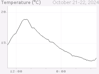
Because drawing text is comparatively expensive, we want to give enough context that the user can understand what the plot is showing. Because the x-axis is labelled with times, we probably don’t need to label it further, and we can use the plot title and some additional text to make it clear that this is a plot of temperature and the wider context of time (ie. the days that the measurements were taken).
The total result is something like this:
Scatter Plots#
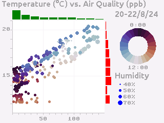
Another common visualization that is well-understood by the typical user are scatter plots and their relatives (such as balloon plots). A well-designed scatter plot can display 4 dimensions of data via x position, y position, color and size.
Continuing the previous example, we also have air quality and humidity values for the same time period. We’d like to show temperature vs air quality as x and y, with humidity and time of day as additional dimensions.
At the core, a scatter plot is just using the Markers shape with
appropriately scaled values:
ys = temperature_scale.scale_values(temperature)
xs = air_quality_scale.scale_values(air_quality)
marker_sizes = humidity_scale.scale_values(humidity)
marker_colors = time_scale.scale_values(timestamps)

# Create point-size geometry for the data points
markers = ColumnGeometry([xs, ys, marker_sizes])

# draw the plot
surface.markers(
    DRAWING,
    markers,
    marker_colors,
    Repeat(Marker.CIRCLE),
    clip=(x, y, w, h),
)
Getting the x and y positions from the data is more-or-less the same as for a point plot, but size and color need a little more discussion.
Color Scales#
For showing color, you need to map your data to colors in a way which fits
the context. Tempe provides a number of color maps in
tempe.colormaps that can be used to assign numeric data to colors.
Like linear position scales, we need to map the numeric values to a position
in the colormap array (probably in a linear manner), but unlike position
scales we need to worry about what to do with values that would lie outside
the range of the array. If you are absolutely certain of the range of the
data (for example, the values are percentages) you may be able to avoid this
potentially at the cost of not using the full range of values. But otherwise
you need to address the problem.
The most common solution is simply to clip the range: any negative indices are set to the 0 index and any high indices are set to the largest possible index, which leads to scaling code like this:
class ColorScale:
    """Object that maps data to color values."""

    def __init__(self, colormap, low_data, high_data):
        self.colormap = colormap
        self.low_data = low_data
        self.high_data = high_data
        data_range = high_data - low_data
        self.scale = (len(colormap) - 1) / data_range

    def scale_values(self, data):
        """Scale data values to color values."""
        colors = array("h", bytearray(2 * len(data)))
        low_data = self.low_data
        scale = self.scale
        colormap = self.colormap
        max_color = len(colormap) - 1
        for i, value in enumerate(data):
            colors[i] = colormap[
                max(
                    min(
                        int(scale * (value - low_data)),
                        max_color,
                    ),
                    0,
                )
            ]
        return colors
But for our particular plot rather than just showing time as a linear colormap where older times range to newer times, the display is more interesting if we instead color by time of day, so we can compare differences between morning, evening and night.
In this case we want a color scale that wraps out-of-range values rather than clipping, which gives us a scale something like the following:
class CyclicColorScale:
    """Object that maps data to color values."""

    def __init__(self, colormap, period, phase=0):
        self.colormap = colormap
        self.period = period
        self.phase = phase

    def scale_values(self, data):
        """Scale data values to screen values."""
        screen = array("h", bytearray(2 * len(data)))
        phase = self.phase
        period = self.period
        colormap = self.colormap
        scale = len(colormap) / period
        for i, value in enumerate(data):
            screen[i] = colormap[int(scale * ((value - phase) % period))]
        return screen
To be effective this needs a colormap which wraps around as well, so that the
minimum and maximum colors are close. The tempe.colormaps.twilight
colormap is designed for such situations and suits the
visualization as well.
Except for the most intuitive situations, color scales need to have some sort of color bar to give context for the user. Two common ways to do this are to use a rectangular greyscale bitmap with the colormap as the palette, or to draw a sequence of lines or rectangles though the color range.
In this example, the color map is circular, so a standard colorbar isn’t the best way to represent this: instead we can show-off the ability of Tempe to easily build non-standard visualization components by drawing the color bar as an annulus:
time_scale_geometry = polar_rects(
    cx,
    cy,
    ColumnGeometry(
        [
            Repeat(20),
            Range(0, 360, 15),
            Repeat(15),
            Repeat(15),
        ]
    ),
)
surface.polygons(
    DRAWING,
    time_scale_geometry,
    time_scale.scale_values([i * 3600 + 6 * 3600 for i in range(24)]),
)
Marker Scales#
Scaling numbers to the size of markers has a similar problem to color scales in that you need to be careful about the low end of the scale and what to do about negative numbers. But there is an additional problem around the way that some marker types are perceived: 2D markers, such as squares and circles have a number of pixels proportional to the square of the size, which can cause larger values to be seen as disporoprtionately bigger. Think of a circle of radius 1 (a single pixel) vs. a circle of radius 10 (about 314 pixels): most people will perceive the radius 10 circle to be more than 10 times bigger.
For these types of markers, it’s common to take square roots of the values so that the values scale in a roughly linear manner as seen by the viewer. For our humidity values, this moght look something like this:
class AreaScale:
    """Object that maps data area for a radius parameter"""

    def __init__(self, low_data, low_screen, high_data, high_screen):
        self.low_data = low_data
        self.low_screen = low_screen
        self.high_data = high_data
        self.high_screen = high_screen
        data_range = high_data - low_data
        screen_range = high_screen - low_screen
        self.scale = screen_range / data_range

    def scale_values(self, data):
        """Scale data values to screen values."""
        screen = array("h", bytearray(2 * len(data)))
        low_data = self.low_data
        low_screen = self.low_screen
        scale = self.scale
        for i, value in enumerate(data):
            screen[i] = int(sqrt(low_screen + scale * (value - low_data)))
        return screen
Creating a scale legend for humidity just involves building a small table of markers and text giving the corresponding values:
sample_humidities = [40, 50, 60, 70]
surface.markers(
    DRAWING,
    ColumnGeometry(
        [
            Repeat(x1 + 30),
            Range(cy + 74, cy + 114, 12),
        ]
    ),
    colors.blue,
    humidity_scale.scale_values(sample_humidities),
    Marker.CIRCLE,
)
surface.markers(
    DRAWING,
    ColumnGeometry(
        [
            Repeat(x1 + 40),
            Range(cy + 75, cy + 115, 12),
        ]
    ),
    colors.grey_a,
    humidity_scale.scale_values(sample_humidities),
    [f"{h}%" for h in sample_humidities],
)
Distribution Plots#
Another common feature of scatter plots is to render the distribution of values along the appropriate axes. To do this, we need to bin the data appropriately. For example, for temperature we might put the data into 1°C bins:
temp_hist = {t: 0 for t in range(11, 22)}
for t in temperature:
    temp_hist[int(t)] += 1
temp_hist_temps, temp_hist_counts = zip(*sorted(temp_hist.items()))
We then need a simple scale for the counts:
temp_count_scale = LinearScale(0, 0, 100, 20)
and then we can create a bar plot using rectangles:
temp_rects = ColumnGeometry(
    [
        Repeat(plot_right + 2),
        temperature_scale.scale_values(temp_hist_temps),
        temp_count_scale.scale_values(temp_hist_counts),
        # the `scale` parameter of the temperature scale gives the
        # distance between rectangles (which is negative), add 2
        # for a bit of visual separation between bars.
        Repeat(int(temperature_scale.scale + 2)),
    ]
)
surface.rectangles(
    DRAWING,
    temp_rects,
    colors.red,
    clip=(x1, y, 20, h),
)
Putting all of this together, we end up with a plot like the following:
Polar Plots#
To create plots which use polar coordinates, you first want to create your polar geometry in polar (r, theta) screen coordinates, where r is radial pixels from the center point, and theta is the angle in degrees of a point.
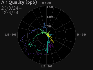
For example, to create a polar line plot of the air quality data, we set up our geometry as if we were creating a regular line plot, but with scales for r and theta values:
air_quality_scale = LinearScale(0, 0, 150, max_r)
# want midnight at top, values going clockwise
time_scale = LinearScale(1729551600, -90, 1729638000, 270)

rs = air_quality_scale.scale_values(air_quality)
thetas = time_scale.scale_values(timestamps)

r_theta_points = ColumnGeometry([quality_rs, thetas])
This is then converted to the cartesian points which correspond to the polar points:
xy_points = polar_points(cx, cy, ColumnGeometry([quality_rs, thetas]))
and from here on we proceed as a regular line plot:
quality_lines = PointsToLines(xy_points)

surface.lines(
    DRAWING,
    quality_lines,
    line_colors,
)
We can color the lines by absolute time to give a bit more context for newer verses older values as the line wraps around:
color_scale = ColorScale(viridis, 1729500000, 1729500000 + 48 * 3600)
line_colors = color_scale.scale_values(timestamps)
Note
Here we converted the points to Cartesian coordinates and then connected them with lines, but an alternative would be to get the line geometry and then convert to Cartesian coordinates:
r_theta_lines = PointsToLines(r_theta_points)
quality_lines = polar_lines(r_theta_lines)
Doing this makes the connecting lines polar geodesics, ie. linear spiral segments between the points.
For this plot the difference is imperceptable, but if the theta values are more widely spaced it will be noticeable. Polar geodesics are generally slower to render, as each r-theta line gets turned into a xy polyline, but the difference can be important in some circumstances, such as drawing a regression line in polar coordinates.
Polar Plot Decorations#
Drawing axes, ticks, grids and labels for a polar plot can be tricky to get a legible result, so it’s hard to give absolute guidelines.
Grids can be drawn using combinations of unfilled circles:
quality_label_values = [50, 100, 150]
quality_label_rs = air_quality_scale.scale_values(quality_label_values)

surface.circles(
    UNDERLAY,
    ColumnGeometry(
        [
            Repeat(cx),
            Repeat(cy),
            quality_label_rs,
        ]
    ),
    colors.grey_3,
    fill=False,
)
and radial lines:
# hourly grid lines
time_grid_values = [1729551600 + 3600 * i for i in range(24)]

r_lines = ColumnGeometry(
    [
        Repeat(air_quality_scale.scale_values([50])[0]),
        time_scale.scale_values(time_grid_values),
        Repeat(int(air_quality_scale.scale * 100)),
    ]
)
xy_lines = polar_r_lines(cx, cy, r_lines)

surface.lines(UNDERLAY, xy_lines colors.grey_3)
In a similar manner, other plot decorations can be positioned by computing their position in polar coordinates, and then transforming to xy-coordinates to draw the appropriate shapes.
The end result might look something like this:
Dynamic Updates#
One of Tempe’s design goals is to efficiently support dynamic updates
of the graphics being displayed. Surface objects keep track of regions
that have changed since the last time that the surface was rendered to a
display, and when refresh() is next called, the Surface will only re-draw
those regions. All Shape objects know the region of the surface that they
occupy have an update() method that applies appropriate changes to the shape
and then will tell their Surface that their region needs redrawing.
So the simplest possible way of updating dynamically is to always call
refresh() immediately after calling update().
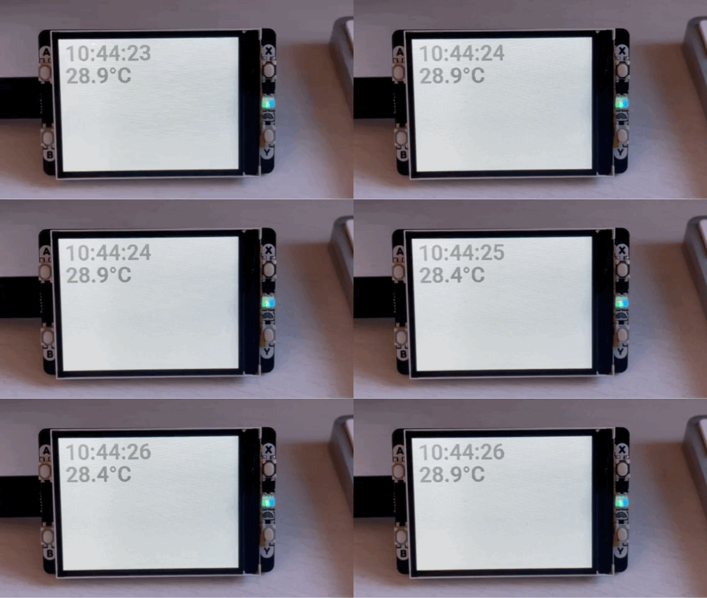
For example if we want to display the current time continuously, we could do something like:
surface = Surface()
time_field = surface.text(
            DRAWING,
    [[10, 10]],
    [colors.grey_a],
    [""],
    font=TempeFont(roboto32boldnumbers),
    clip=(10, 10, 240, 40),
)
rtc = RTC()

while True:
    h, m, s = rtc.datetime()[4:7]
    text = f"{h:>2d}:{m:02d}:{s:02d}"
    # only update if the text has changed
    if time_field.texts[0] != text:
        time_field.update(texts=[text])
        surface.refresh(display, working_buffer)
    time.sleep(0.1)
While this works, it quickly becomes awkward once there is more than one
thing going on. In these situations, the standard approach is to use
asyncio (Micropython’s version of the Python asyncio
module).
Asyncio#
If you are unfamiliar with asyncio, it is worth your time to read up on
the topic. The documentation for Micropython asyncio
can give you a basic idea of the capabilities, but Peter Hinch’s excellent
Micropython asyncio tutorial
gives better practical advice (and discusses differences with Python’s version of
asyncio, if you are familiar with that).
From here on we are going to assume a basic familiarity with asyncio.
Converting our previous example to work asynchronously is not too difficult.
We need to take the loop and turn it into an async function, and use
asyncio.sleep() instead of time.sleep():
async def update_time():
    while True:
        h, m, s = rtc.datetime()[4:7]
        text = f"{h:>2d}:{m:02d}:{s:02d}"
        # only update if the text has changed
        if time_field.texts[0] != text:
            time_field.update(texts=[text])
            surface.refresh(display, working_buffer)
        await asyncio.sleep(0.1)
This change permits python to do other things during the time that this
function is sleeping. You can then schedule this and any other tasks that
you have using asyncio.run and asyncio.gather:
async def main():
    await asyncio.gather(
        update_time(),
        # and other async things that you are running...
        ...
    ))

asyncio.run(main())
This allows you to integrate Tempe drawing with typical asyncio-based code.
Event-Driven Refreshing#
Tempe has one more trick up it’s sleeve when it comes to dynamic updates: if two regions need updating, but one is contained in the other, Tempe knows that it only needs to worry about updating the larger region. This saves calls to update the display, which is moderately time-consuming.
One consequence of this is that while calling refresh() immediately after
each update(), it’s generally better to batch update() calls and then call
refresh() once.
For synchronous code, this looks something like:
while True:
    ...
    # update shapes
    time_field.update(texts=[time_text])
    temp_field.update(text=[temp_text])
    temp_plot.update(
        geometry=ColumnGeometry(
            [scale_times(times), scale_temps(temps)]
        )
    )
    ...

    # refresh display
    surface.refresh(display, working_buffer)
    time.sleep(0.1)
But for asyncio code, how do you handle multiple different tasks updating
the Surface independently?
Although Surface isn’t tightly integrated with asyncio, it does have one
hook that asyncio-based code can make use of:
when a
Shapetells aSurfacethat a region needs updating, theSurfacehas anasyncio.Eventinstancerefresh_neededwhich it fires.when
refresh()is called, it resets therefresh_neededevent.
This means that you can have an asyncio task that awaits refresh_needed
and then calls refresh():
async def refresh_display(surface, display, working_buffer):
    while True:
        await surface.refresh_needed.wait()
        surface.refresh(display, working_buffer)
This allows you to nicely decouple the update function so all it needs to know about is the shape(s) it works with:
async def update_time(text_field):
    while True:
        h, m, s = rtc.datetime()[4:7]
        text = f"{h:>2d}:{m:02d}:{s:02d}"
        # only update if the text has changed
        if text_field.texts[0] != text:
            text_field.update(texts=[text])
        await asyncio.sleep(0.1)
You could similarly have a function which updates a temperature field every second:
async def update_temperature(text_field):
    while True:
        value = adc.read_u16()
        temp = 27 - (3.3 * value / 0xFFFF - 0.706) / 0.001721
        text = f"{temp:.1f}°C"
        # only update when needed
        if text_field.texts[0] != text:
            text_field.update(texts=[text])
        await asyncio.sleep(1)
Putting all of this together, you get a main function which looks like:
async def main():
    ...
    await asyncio.gather(
        refresh_display(surface, display, working_buffer)
        update_time(time_field),
        update_temperature(temperature_field),
        # and other async things that you are running...
        ...
    ))

asyncio.run(main())
